splitButton
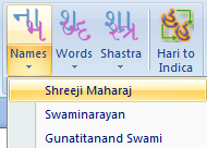
A splitButton is a button plus a menu. The top half is a button that you can click to perform a default or common action right away. The bottom half is a drop down menu for more items. The XML code is below. The splitButton has a button control that gives is a one-click functionality plus a menu control for the buttons that will be in the dropdown menu. Hence, it has sub-buttons.
<splitButton id="Names" size="large">
  <button id="Namesbutton" image="Nam" label="Names" onAction="RibbonXOnAction" tag="myMacroToRun" screentip="Shreeji Maharaj" />
  <menu id="NamesMenu" itemSize="normal">
    <button id="ShreejiMaharaj" onAction="RibbonXOnAction" tag="guj_ShreejiMaharaj" label="Shreeji Maharaj" />
    <button id="Swaminarayan" onAction="RibbonXOnAction" tag="guj_Swaminarayan" label="Swaminarayan" />
    <button id="GunatitanandSwami" onAction="RibbonXOnAction" tag="guj_GunatitanandSwami" label="Gunatitanand Swami" />
  </menu>
</splitButton>
Separator
There are times you want related controls separated within a group. The separator control comes in handy. The XML is simple with only a unique ID.
<separator id="separatorfonts" />
Label Control
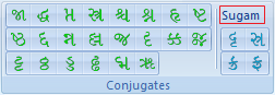
Another handy control is the labelControl. This control allows you to label a group of related buttons. As can be shown in the image, there are 4 buttons related to the font Sugam. Hence, I separated them with a separator and applied a labelControl to specify they are for Sugam font.
<labelControl id="SugamLabel" label="Sugam" />
Button Groups
Another control that allows you control over how buttons are displayed is the buttonGroup control. By default, small buttons are stacked top to bottom in three's before moving to next column. If you prefer to arrange your buttons in rows rather than columsn, then you enclose them in a buttonGroup. In the image above, all the buttons are arranged in buttonGroups of 8 buttons × 3 rows (and 2 × 2 for Sugam).
<buttonGroup id="conj3">
   <button id="tta" image="tta" screentip="tta" onAction="RibbonXOnAction" tag="guj_tta" />
   <button id="ththa" image="ththa" screentip="ththa" onAction="RibbonXOnAction" tag="guj_ththa" />
   <button id="dda1" image="dda1" screentip="dda (hard)" onAction="RibbonXOnAction" tag="guj_dda1" />
</buttonGroup>